
HOMER
Software for motif discovery and next-gen sequencing analysis
Mastering Excel for Genomics Analysis
Excel is a useful spreadsheet program that is used in nearly
every research laboratory (and pretty much every workplace
that uses computers). Excel can be very useful for the
following functions:- Data manipulation and analysis
- Data visualization, creation of graphs/figures
- Formatting of data for use in other programs
Basic Tips for Excel:
- When highlighting a selection, NEVER drag! Hold Shift+Ctrl+Arrow Key to auto select to the end of the worksheet, or until there is a blank space.
- To auto-complete a formula, double-click on the little black box on the low-right of an active cell.
- Always use 'normal view' (i.e. menu bar->View->Normal). Don't use 'Page Layout' unless you have a good reason.
- Consider making Excel the default program for files
with extensions *.txt, *.csv, *.tsv, etc. (can
save a lot of time instead of using "open with
Excel...")
Highlighting Differential Genes in a Graph
X-Y scatter plots are a great way to display information for figures in papers or presentations - much much better than venn diagrams, which should probably be outlawed. Often you may want to highlight some of the point in the plot to draw attention to them - for example, highlight the points that represent differentially expressed genes.
The general strategy I recommend is to plot a second set of points 'over' the first set. You can use an 'if' statement formula to determine if the gene is differentially expressed based on a p-value or fold change: if the data point is differentially expressed, plot the data over the original data point. If not, plot the data point 'off' the graph where you cannot see it.
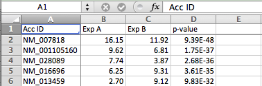
- Load you data in to excel. Lets assume you have log-transformed expression values for two experiments and a p-value for each gene. For example:
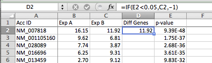
- Insert a new column to the right of the columns you want to plot (in this case between C & D). Put "Diff Genes" or some type of description in the first row of the new column
- Enter the formula =IF(1*,2*,3*) in the 2nd row of the new column, where 1*, 2*, and 3* are:
- Conditional test for differential expression (in example below, E2 < 0.05 for checking if the p-value is less than 0.05)
- The value if the test is true - we want to value to be the y-value in the x-y plot (C2 in this example)
- The value if the test is false - we want a value that is 'away from the data' - in this case -1, which will not overlap with any of the data from the first two columns
- Autocomplete the formula down the whole column by selecting the cell with the formula, and then double-clicking on the little black box in the lower right-hand corner of the box.
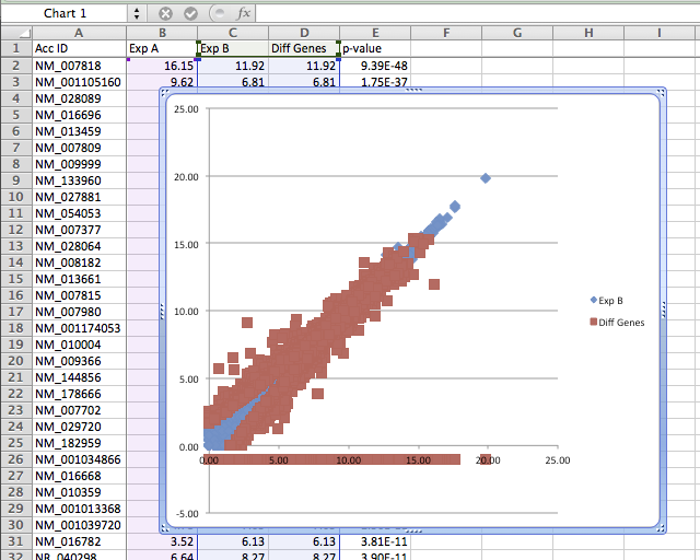
- Highlight all 3 data columns (original data from Exp A, Exp B, and the new column with the formula) and create an X-Y scatter plot.
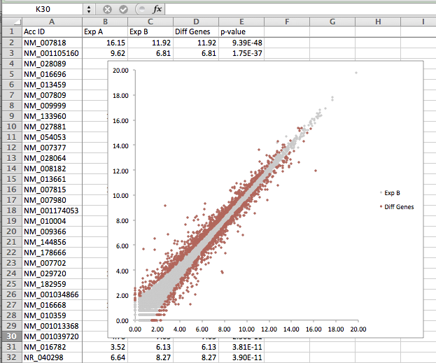
- Now that you've created the plot - now it's time to clean up the setting to make it pretty. The first thing you want to do is change the y-axis to only show values above zero - to get ride of the red points representing genes that were not differentially expressed (-1 from the IF statement above). After changing the colors, size of the points, and changing the y-axis, you can get something that looks like this:
- You can also try updating the formula to change the p-value threshold (i.e. 0.001 instead of 0.05) - change the formula at the top, and then autocomplete it and watch the graph update automatically!
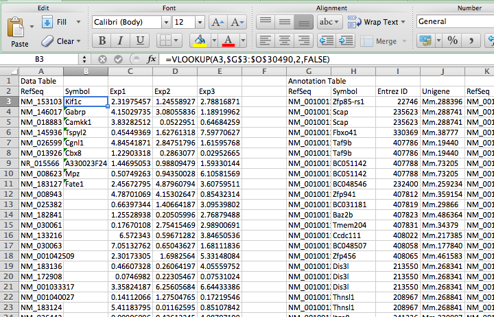
Adding Gene Annotation (i.e. Database Join in Excel using vlookup):
First thing you need is an annotation table, with the ID you want to convert with the gene name or other information on the same line.
- Load the ID annotation table into Excel.
- Load your data in Excel.
- Make sure the accession/ID that you want to convert is in the far left column of the annotation table.
- Sort the annotation table by the far left column (the ID you want to convert)
- Copy the annotation table next to you data in the same spreadsheet (you can leave a column of space to keep them separate)
- Insert a new column into YOUR data next the ID you want to convert.
- Enter the formula for =VLOOKUP(1*, 2*, 3*, 4*), where 1*, 2*, 3*, and 4* are:
- lookup value (the cell of the ID you want to convert in your data table)
- the entire ID annotation table. Highlight the whole thing (no header). VERY IMPORTANT - after you highlight the whole thing, add "$" in front of the row and column values. For example: K2:O21344 >> $K$2:$O$21344. This way, when you auto-complete or drag the formula, these values will not change
- Enter the column number, in the annotation table, that you want to return (i.e. "2").
- Enter "FALSE" - you never want to enter true for this value.
- Auto-complete the formula down the length of your data.
- Copy the new values and then paste-special the "values" to remove the formula
- Delete the annotation table - and you're done!

Can't figure something out? Questions, comments, concerns, or other feedback:
cbenner@salk.edu