
HOMER
Software for motif discovery and next-gen sequencing analysis
Analysis of Large Expression Data Sets
Once you starting trying to compare more than two
experimental groups, things start to get very
complicated. Well thought-out statistical methods are
available for comparing two experimental conditions, but
when you get the three or more all bets are off! As a
result, you may want to turn to other analysis methods such
as those describe below. These methods work well with
both RNA-Seq and Microarray data, and can also be used with
other data types, including ChIP-Seq, MethylC-Seq, or
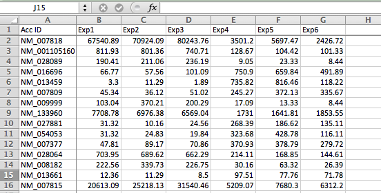
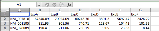
anything else!All of the methods here assume you have your data available as a normalized gene expression matrix, defined as a tab-delimited text file with each row corresponding to a gene and each column a different experiment (Doesn't need to be gene expression, but you need a 'matrix' of data). You may need to use Excel to format your data like this. When analyzing gene expression, it's best to use a common gene accession number or gene symbol for the Gene ID so that you can use your results with other tools later (as opposed to a custom ID or probe set ID). Below is an example of a proper starting file:
Gene Expression Clustering
Gene expression clustering is one of the most useful techniques you can use when analyzing gene expression data. Not only can it help find patterns in the data that you did not know existed, but it can also be useful for identifying outliers, incorrectly annotated samples, and other issues in the data.
There are many different types of clustering - the two most popular are:
There are also many different software tools for clustering data (clustering is a very general technique - not limited to gene expression data). Methods are available in R, Matlab, and many other analysis software. Easily the most popular clustering software is Gene Cluster and TreeView - originally popularized by Eisen et al. The basic idea is to cluster the data with "Gene Cluster", then visualize the clusters using TreeView. These programs are now available in more modern versions:
- Hierarchical Clustering (binary tree grouping samples)
- K-means (data is organized into k clusters)
Gene Cluster 3.0
Java TreeView
Guide to Clustering your data
- Save your data as a tab-delimited text file like the example above.
- Open File: Gene Cluster 3.0 and use the top menu to load your text file.
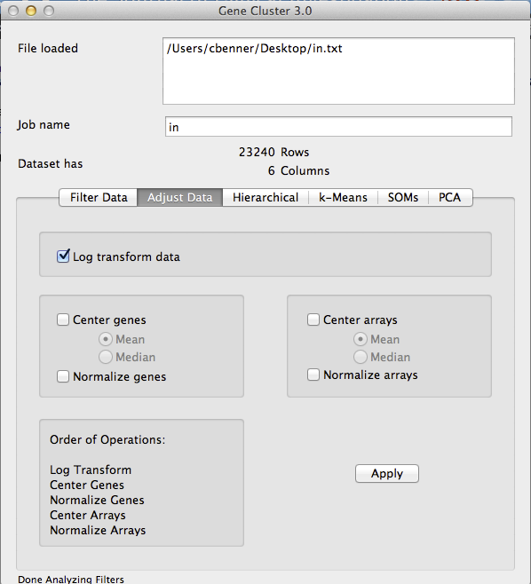
- Log Transform [If needed]: If your data is not log2 counts/intensities, then log2 transform your data by clicking on the 'Adjust Data' tab, clicking the 'Log transform data' box, and then clicking 'Apply' - your data will now be log transformed.
- Filter Data: Next, you need to filter your data to remove low expressed and invariant genes. This must be done for two reasons. First, genes that are not differentially expressed or barely detectable will contribute noise to the resulting clusters. Second, hierarchical cluster (of genes) is an O(n^2) operation, and it might take a long time to cluster more than 5k or 10k genes. If you want to cluster a very large number of genes/features, try k-means instead.
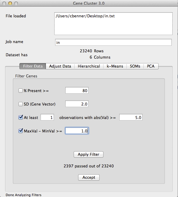
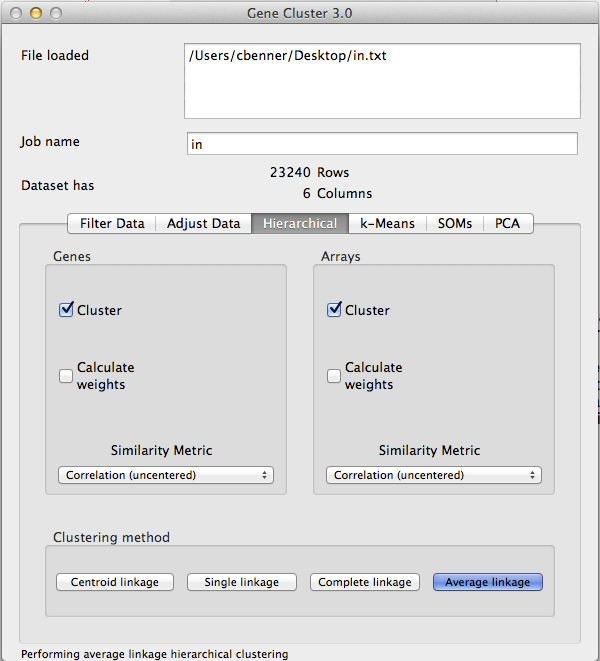
Filtering your data is more of an art form than science, but I would recommend using both the 3rd and 4th filters on the "Filter Data" tab. The 3rd filter removes genes that do not have sufficient read depth/intensity, while the 4th one removes samples that do not vary much. For example, in the picture below I am removing any gene where not one of the samples has more than 25 normalized reads in the gene (2^5 - it's log2 data), and I am removing genes where the samples with the highest and lowest expression are less than 2-fold different (1.0 is 2-fold for log2 data).
Once you click "Apply Filter", the software will tell you how many genes you have left. I would recommend adjusting the parameters such that you end up with no more than ~5k genes. You can allow more, but it will take longer to cluster. Once you are happy with the filtering results, click 'Accept'. The Dataset information toward the top should update with the new number of Rows.
- Center Genes: In order to get the nice green and red images from clustering, you need to 'center' your genes. Each gene is represents a vector of values - basically, we want to subtract the mean values of the gene from each experiment so that the resulting values represent the relative expression of the gene. Click on the 'Adjust Data' tab again and click the Center Genes/Mean. Make sure you deselect the Log Transform box if it is still selected - you do not want to log transform your data a second time. Click 'Apply' to center the gene values. I do not recommend centering the arrays or 'normalizing' any of the values. By only centering the genes, the values are still real values that represent the relative log2 fold change compared to the mean of the gene. Once you start adjusting the data in other ways the value becomes hard to interpret.
- Hierarchical Clustering: Time to cluster the data. Click on the Hierarchical tab and select Cluster for both Genes and Arrays. Then click "Average Linkage" to start clustering the data. I would not change the distance metric from "correlation(uncentered)" unless you know what you are doing. The default and 'average linkage' are appropriate for >98% of the clustering you will want to do.
Clustering will automatically produce 2 or 3 output files in the same directory where your input file is located. The *.atr and *.gtr files contain information about the clustering result (trees), and the *.cdt file contains information for the heatmap.
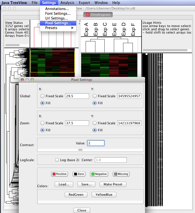
- Visualize the results with Java TreeView: After running the program, load the *.cdt file produced during the clustering steps. Java TreeView is easy to figure out after trying things for a little while. The most useful option are the "Pixel Settings" in "Settings" menu. You can use these to change the relative appearance (colors, size of data points, etc.) of the data. You can also export the clustering results as image files or postscript files.
Useful Tips for Clustering Analysis
- Be careful of zeros in your data - if you log transform the data these data points will become 'NA' and cause problems. I highly recommend adding +1 to all read counts in Excel before importing the data into Gene Cluster 3.0 and taking the log - this will cause a minimal change in the data and avoid problems with taking the log of zero.
- When looking at the clustering results, replicates should cluster together. If they don't, you may want to revisit your experimental protocols or the experimental design. If replicates for a given condition do not cluster together, that's a sign that the largest sources of variation are caused by things other than your experimental condition, and your study may need more replicates to have the power to identify key genes (or you might want to study a different problem or use a different system).
- It can be very useful to identify key clusters of genes and perform functional enrichment tests on them. Highlight a cluster of genes in Java TreeView, then go to "Export -> Save List". Copy the list and paste it into DAVID or a similar Gene Ontology enrichment tool. This can be useful for figuring out what went wrong with a certain outlier sample - i.e. maybe it is infected, proliferating more than the other samples, has tissue contamination, etc.
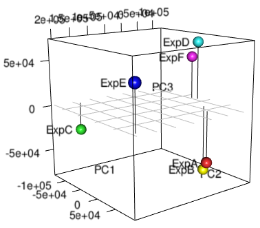
Principal Component Analysis (PCA)
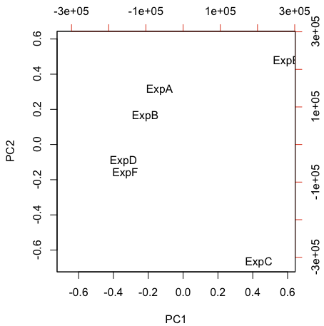
PCA is another useful style of unsupervised analysis that can be useful for large data sets. PCA is nice in that you can understand the relative relationship between each sample in 2 or 3-dimensional coordinate space. By contrast, hierarchical clustering only tells you which samples are most similar to one another - samples in separate trees may be partially related to one another, but that information is lost in the binary tree.
Many different software packages can perform PCA analysis with your data - below are instructions for how to do it in R:
First, save our gene expression matrix as a tab-delimited text file as shown above, with ONE EXCEPTION - delete the value in the very first row. This helps keep the other commands happy. Also, I've noticed it can have trouble reading the file if there are spaces in the sample names. Like this (nothing in A1):
It is also a good idea to remove genes with low expression and log transforming the data before saving the file (unlike the example above!).
Open R, and then change the current directory ("Misc -> Change Working Directory") to the directory containing your file (For this example the input file is "input.txt").
# Read in data and find principle components
x <- read.table("input.txt")
xx <- prcomp(t(x))
# Visualize the results in 2D using biplot
biplot(xx,var.axes=FALSE,ylabs=NULL)
# Visualize the results in 3D using rgl library - may need to install rgl first
# May want to change the radius in the spheres3d command if too big or small
library(rgl)
plot3d(xx$x,xlab="PC1",ylab="PC2",zlab="PC3",type="h")
spheres3d(xx$x, radius=7,col=rainbow(length(xx$x[,1])))
grid3d(side="z", at=list(z=0))
text3d(xx$x, text=rownames(xx$x), adj=1.3)

Can't figure something out? Questions, comments, concerns, or other feedback:
cbenner@salk.edu